Tower Hamlets
Designing and building a digital hub for the Tower Hamlets Number Partners programme
Number Partners is a programme running under the Tower Hamlet Business Education Partnership. It aims to improve the numeracy of young people while at the same time bring them into contact with volunteers from the world of work.
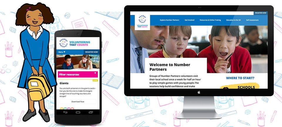
They approached me to redevelop their website as the existing version was suffering from a broken content management system and was in need of a complete overhaul. After an enthusiastic first meeting I was happy they were really open to completely starting from scratch, meaning we could really approach the build in a considered and holistic way.
- Date
- 2013
- Role
- Design Lead
- Responsibilites
- UX, user research, prototyping, user testing
Prioritizing Content
‘Content first’ design recognises that the content of a site is the highest priority, and it should not be considered outside of the main design process.
“It’s important to have a style that is appropriate, but hard to develop that style without an understanding of content.” — Jeffrey Zeldman
With this in mind I made an audit of the existing content, and from this drew up a list of questions for Number Partners to better understand their goals. They are addressing four different audience types, each of whom formed a different relationship with Number Partners. Through the audit it became apparent the distinction between these user groups was unclear and in turn prohibiting people from registering their interest – the main goal of the site.
I suggested we give these four user groups a more tangible identity which would shape and guide the users’ journey through the site. The backdrop of children’s education provided the perfect lead to establish a visual identity which was bright, illustrative and engaging.
I started out creating style tiles to capture the essence of this. Through this emerged the concept of a Number Partners brand colour palette, and then a sub set of colours each representing a user group. This way pages of the site relating to a specific user could be easily identified, and more general pages could hold the Number Partners brand.
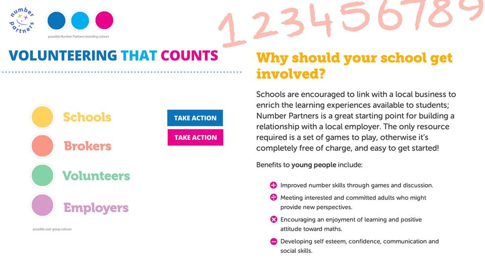
The feedback from Number Partners was very enthusiastic, and so I drew up a proposal to elaborate this by creating characters to represent each user group, along with logos and supporting illustrations which used the agreed colours to reinforce these identities.
We commissioned Kate Maxwell to produce these illustrations, and she did a fantastic job in understanding the ideas behind the approach. The results were the perfect balance of engaging illustrations which communicated the different user groups.

Development
Inspired by the fantastic workflow Brad Frost has been sharing, I set out to put a similar atomic design approach into practice to see how it could benefit the project.
I set up an install of patternlab and optimised the existing sass files to incorporate some aspects of inuit.css, as well my own established toolset of SASS modules. I then sketched out an interactive wireframe of the site in patternlab based off an initial site map that had been created in the content audit.
This was quick to do, and facilitated a meeting with the client where we could navigate through a low fidelity version of the site to get a sense of the user journey and how it all hung together. This proved to be a fantastic benefit – conversations were naturally orientated to the experience of the site in the browser from the very beginning, which kept things focused and fast moving.
From this point onwards it was very natural to implement feedback into a revision of the wireframe while at the same time introducing the next level of detail to the templates. This iterative process continued until we arrived at a pretty polished set of templates ready to be converted into a wordpress theme.
Dan Bissonnet handled the wordpress development and I had been keeping him astride of the front end paternlab build from the outset. This meant we had time to discuss the best approach for the CMS integration and tailor it to best fit the direction that the development had taken. This meant it was a quick journey from the finalised templates through to a fully functioning version of the site.